- - -
ENTREPRENEURIAL
- - -
Sneaker
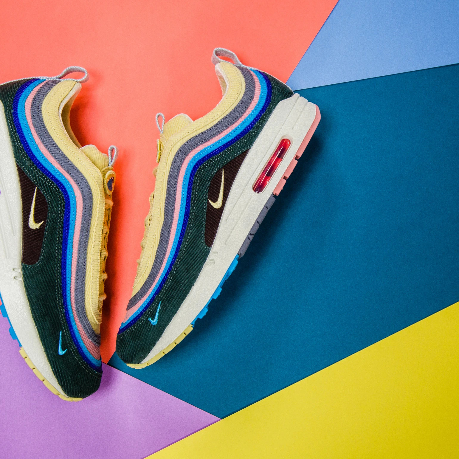
My passion for sneakers began when I was a teenager. I was blown away and immersed in the history of the great manufacturers and the concepts between artists and brands.
I started selling some pairs to get my own for free and continued to do so for a few years. Finally, in 2022, I turned it into a small side business. I see this small business as a project to make money on the side, but mostly as a way to learn about entrepreneurship and taxes from real-world experience while pursuing a full-time degree. Most importantly, it's a way for me to continue my passion in my daily life.
Over the years, I developed a deep connection with the entire culture, art and fashion ecosystem around sneakers, which had a lasting impact on my personal development and experiences.

- - -
CREATIVE STATUS
- - -
The artist Michel Heimes, who creates under the synonym Marble, positions himself particularly in the conceptual art direction. He is excited by the interplay of the known with the unexpected and the resulting creation of new perspectives.
He is convinced that counterintuitive connections are necessary to rediscover the often lost passion for the individual.
He is convinced that counterintuitive connections are necessary to rediscover the often lost passion for the individual.
Concepts
Toilet Show
Going to the toilet is commonplace for every person among us, and yet very little is said about it.
Marbel believes that this lack of communication is a key barrier to innovation in the field.
What if we could use the time there more effectively? For example, to get from A to B?
Marbel believes that this lack of communication is a key barrier to innovation in the field.
What if we could use the time there more effectively? For example, to get from A to B?
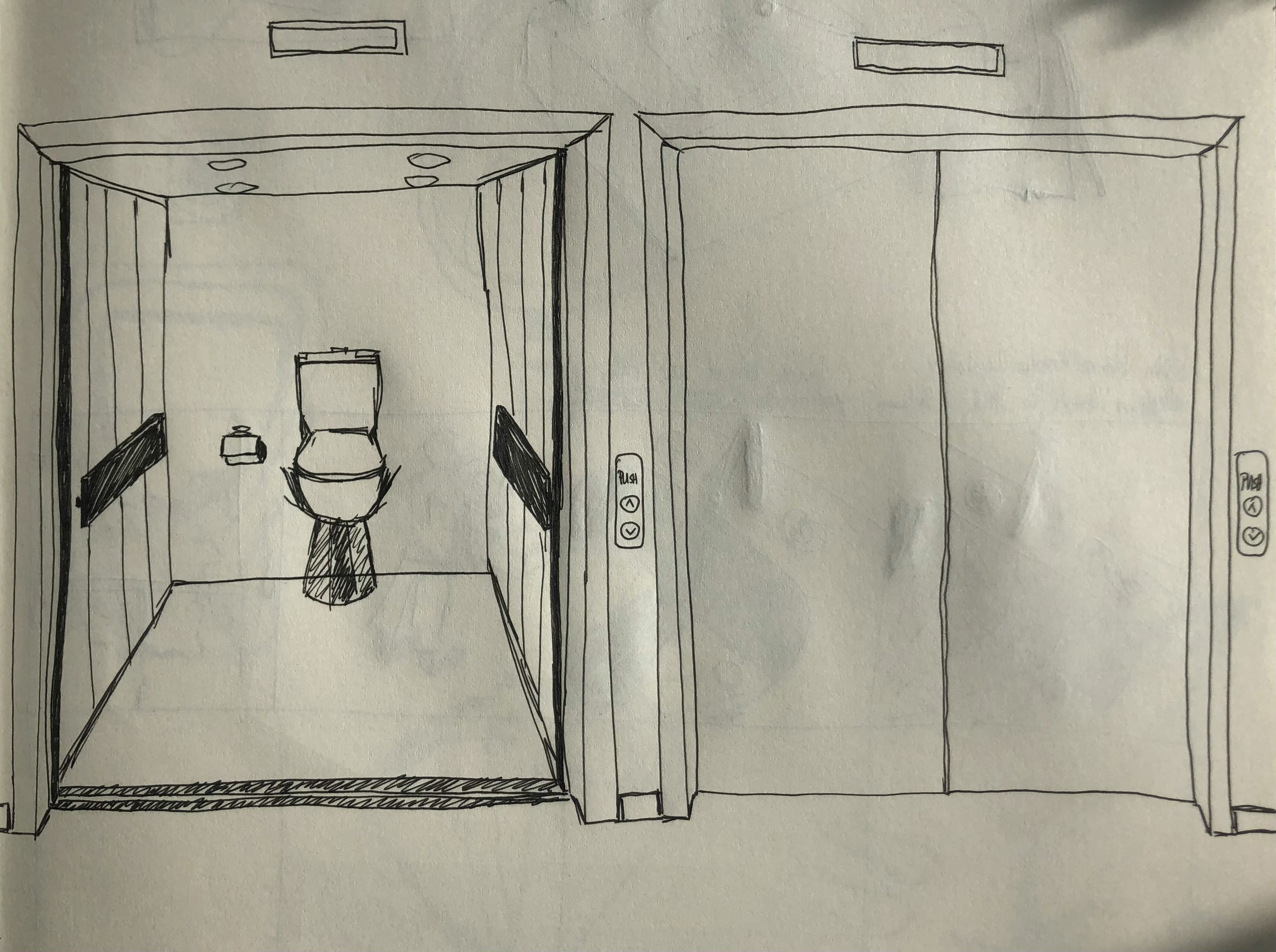
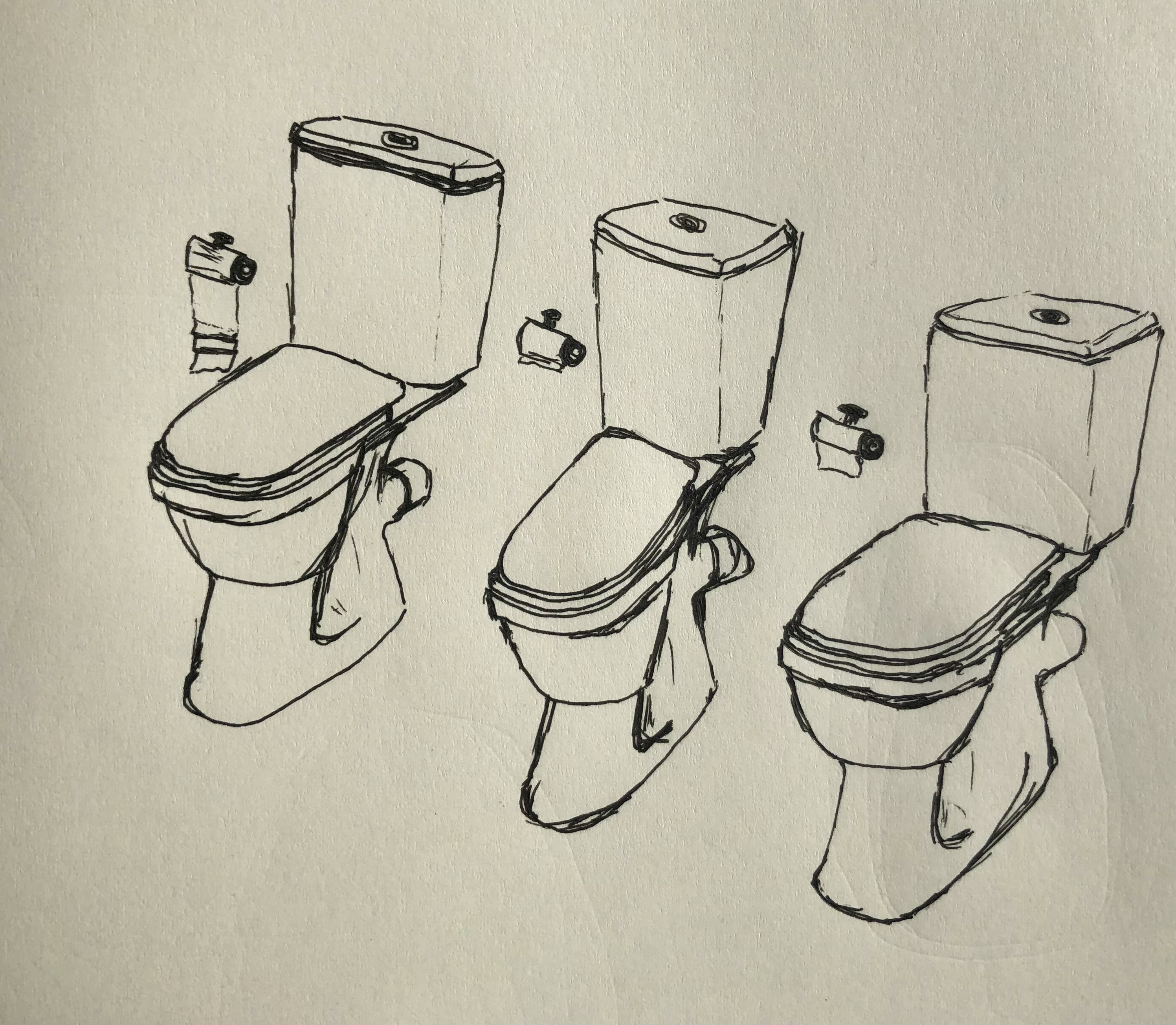
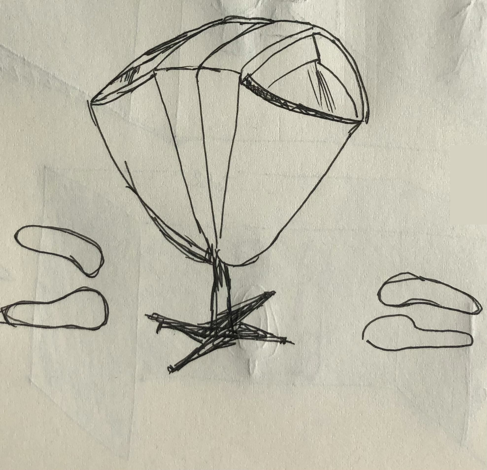
If you look at the history of modern toilet culture, it is characterized by the gathering of a wide variety of people in this one place.
In the sanitary facilities of ancient Rome, there was room for up to 80 people, but nowadays it has become a very lonely place.
One might think that we're entangling ourselves from new friendships and lucrative business deals.
In the sanitary facilities of ancient Rome, there was room for up to 80 people, but nowadays it has become a very lonely place.
One might think that we're entangling ourselves from new friendships and lucrative business deals.
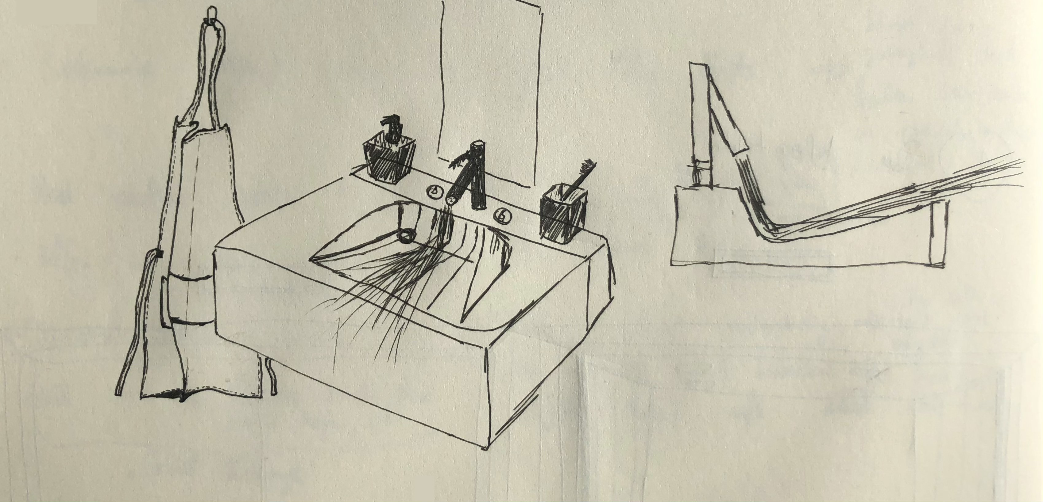
Tap on, tap off, towel here, dry off on the trouser leg there. Automatisms determine our lives even in the most humid area of our living space - the bathroom. To escape the daily grind is the mission that Marble has dedicated himself to with this work. It resembles a performance - for everyone.
Why know exactly what will happen in life when you can give it a little more experience?
Why know exactly what will happen in life when you can give it a little more experience?
Flag Puzzle
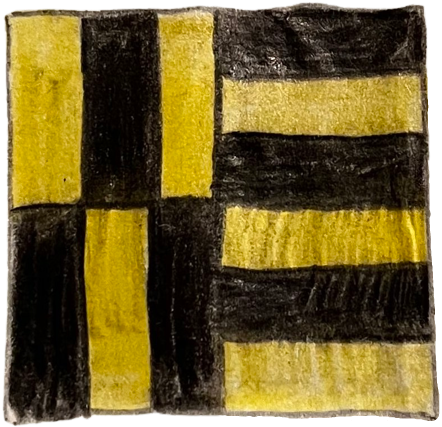
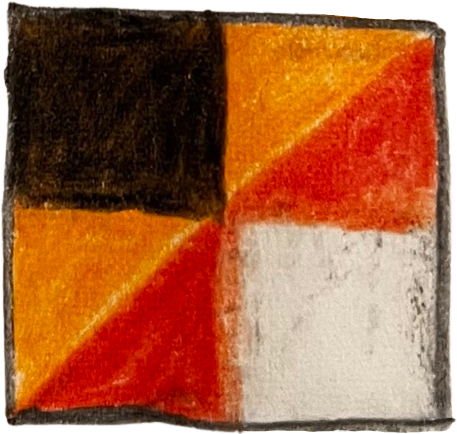
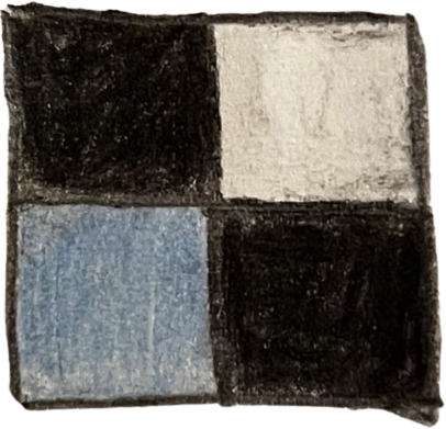
Flag puzzle is an art concept that aims to close the gap between the space of objectivity and subjectivity.
Each symbol refers to another character, while some refer to rule elements. Reading the colors and shapes in the correct order allows the viewer to decipher the artwork.
While the objective meaning remains clear, the individually arranged symbols and colors provide an open space for subjective interpretation and evoked emotions.
He was inspired by the Japanese artist Tetsuo Mizù and by historical German flags, Marbles' country of origin.
What do we actually do in a museum?
Do we think about how beautiful the art looks?
Do we think about the emotions of the artists who worked on it and their intentions?
Are we trying to look intellectually interested?
Do we do anything at all?
Do we think about how beautiful the art looks?
Do we think about the emotions of the artists who worked on it and their intentions?
Are we trying to look intellectually interested?
Do we do anything at all?
The idea of not having to constantly search for the meaning and the right interpretation is appealing to him.
He is a fan of clarity yet inspired by individual views and stories.
His works reflect controversial, world political events and are trivial at first glance. They are thought-provoking, can be explained logically, and yet have a different meaning for each person.
He is a fan of clarity yet inspired by individual views and stories.
His works reflect controversial, world political events and are trivial at first glance. They are thought-provoking, can be explained logically, and yet have a different meaning for each person.
- - -
UNIVERSITY/ CODE & CONTEXT
- - -
These projects were developed as part of the Code & Context study program at the Cologne University of Applied Sciences.
Generative design
The following works were created during the course Generative Design in the second semester.
Simply a color contrast or already art?
The interplay of colors and their effect
Where does the concept of a simple color contrast end and where does art begin?
This work was guided by the questions: How do colors work together and what emotions can the coordination of colors cause.
During my process I was inspired by artists such as Vincent van Gogh, Franz Marc, Paul Cézanne, Gerhard Richter and Paul Klee, the latter of whom moved me to work out my finished concept with his painting "New Harmony".
Always the same arrangement of forms, but a completely different effect on the participant. Harmonies and disharmonies, contrasts decide. The regular distribution of shapes allows them to fade into the background and focus on the essential, the color. At the same time, this gives the design continuity, which has the effect that color contrasts are not weakened, but meet in their full intensity.
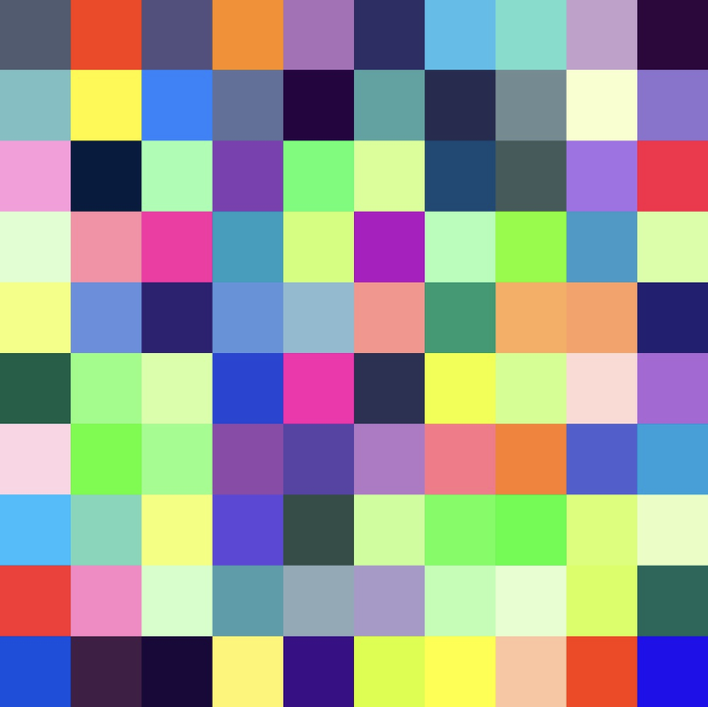
The following contrast concepts were particularly appealing to me:
The Complementary Contrast, the Color-As-Such Contrast, the Colorful-Uncolored Contrast, the Quantity Contrast, and the Cold-Warm Contrast.
These concepts can be selected and displayed using the ready-made parameters via the external web page selectable below.
The Complementary Contrast, the Color-As-Such Contrast, the Colorful-Uncolored Contrast, the Quantity Contrast, and the Cold-Warm Contrast.
These concepts can be selected and displayed using the ready-made parameters via the external web page selectable below.
It is important to note that all other checkmarks should be unchecked so that no complications occur. In the case of the quantity contrast, the color of the many single-color areas can also be changed by the additional parameters listed under the "quantitaetsKontrast" parameter according to the specified color. By means of the slider "Mix_Or_Change_Things_Up" it is also possible to change the distribution of the colors according to the chosen contrast concept (except for the "color-at-a-time contrast"). The use of this function in conjunction with the complementary contrast is particularly interesting here, since moving the slider from zero to one hundred also changes the mutually complementary colors along the color circle. So where does art begin and up to where is it merely an arrangement of colors next to and among each other? A quotation of the artist Vincent van Gogh describes this quite well and coincides with my personal answer to the question: "There are harmonies and contrasts hidden in the colors, which work together all by themselves. According to this, the art rests in every color combination and is only dependent on the parameter of individual observation and the emotions evoked at that moment.
Depth points
...and how diversity emerged from the point
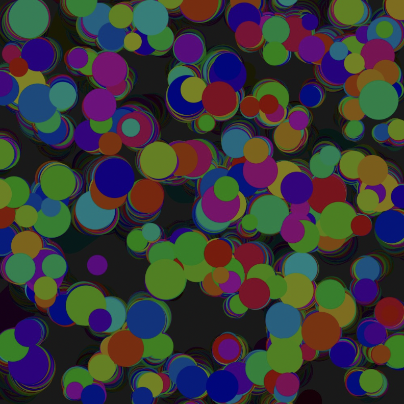
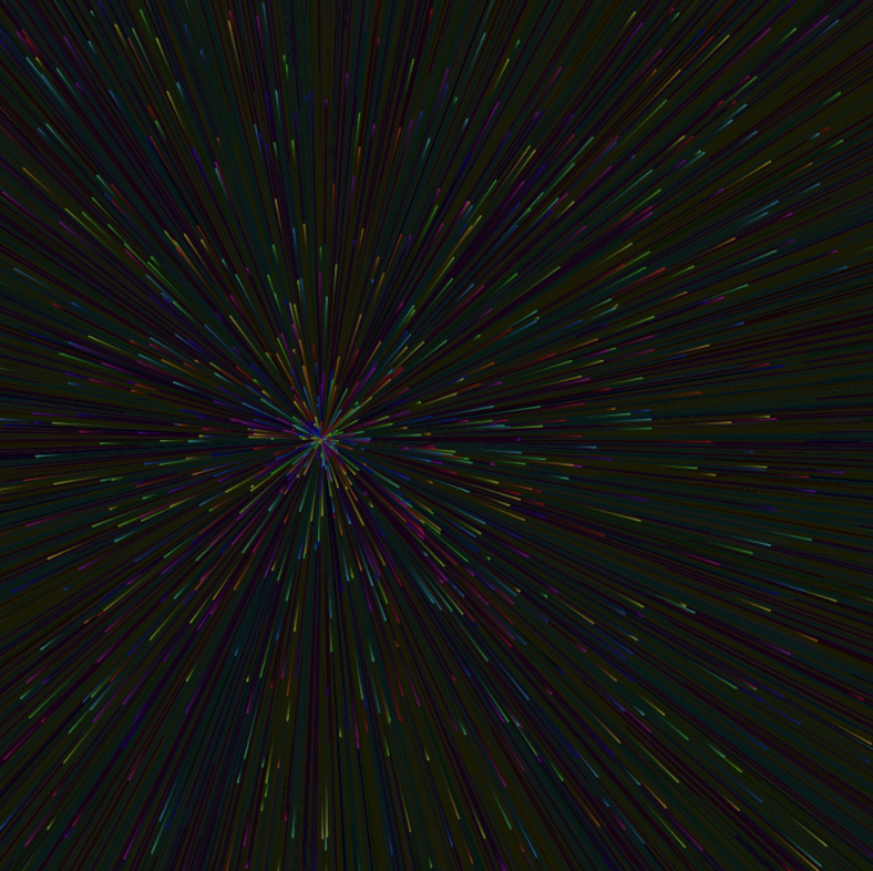
This sketch is based on the idea of different-colored glowing dots that appear in a random arrangement on the image area, creating the same effect as party lights. I was also excited by the implications of the alpha value of the background and the before and background theme.
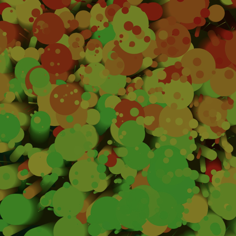
As the process progressed, I realized that it was interesting to add movement to the dots. Each newly created point was now given a direction, but that direction changed with each new run of the program (25 times per second). In combination with a low alpha value of the background, this created something extremely interesting - depth. Even after a long time of viewing, one could always discover something new. You could say that the dots resembled canyons and dark caves, the inside of which is mysterious and hidden.
The intensity of this alpha value can be adjusted via the "backgroundAlpha" parameter slider. For the described result, this value should be as low as possible (1-2) and, in addition, the check mark at "randomSeed" should be removed. By adding the function of "randomSeed" in the further process it was made possible that the points continued to move in the same direction despite several passes, whereby the sketch clearly gained in dynamics, partly even in perspective. This can be seen especially in the second image, which is formed when the parameter "preset1" is selected. Independent of this parameter, the size of the dots can also be set using the "randomDotSizeMinimal" and "randomDotSizeMaximal" sliders, which determine the minimum and maximum size of the generated dots.
Also the color spectrum along the color circle, the speed of the dots, the brightness of the background and the number of times the program runs per second are bound to the parameters "colorMinimal", "colorMaximal", "dotSpeed", "backgroundBrightness" and "frameRate" and can be adjusted.
What makes the Sketch particularly interesting and exciting is the variety of images that can be observed as you change the values of the parameters, turning the Sketch into a work of art that evolves over time. As is so often the case: Trial and error! It gets exciting when you change single parameters like "randomDotSizeMinimum", "randomDotSizeMaximum" and "dotAlpha" in time intervals of ten seconds (or more if you like) and switch "randomSeed", "preset1" and "preset2_TinyComets" on and off alternately. This creates depths, layers as well as foregrounds and backgrounds and gives a whole new meaning to the term multilayer in this context.
That all this arises from simple points shows how versatile a "simple" point actually is.
Pillars of life
The two sides of existence
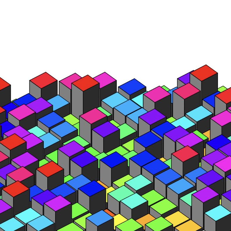
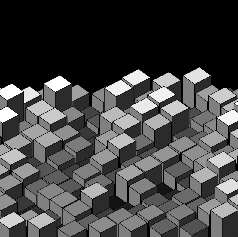
My basic motivation for this sketch was two main points. First, I wanted to design a sketch that in some way created three-dimensional objects, and second, my goal was to have a higher meaning inherent in it all - life.
Once the basic mechanics of the columns were in place, it quickly became clear that the theme of ups and downs in life would lend itself and that this linguistic image would relate to the change in height of the columns.
In the sketch, there are two different parameters as setting options - "Gain" and "Pain". The height differences of the columns visualized in "Gain" stand for the insignificant problems, the small and big joys of everyday life as well as the confrontations with mistakes from which one grows and which result in good things. In summary, it can be said that the problems associated with this can be managed well in most cases.
In addition, however, there is also the "Pain". The "Pain" attitude stands for the less easy to cope with setbacks, hurtful moments and losses, from which there often seems to be no way out. In these times, everything seems bleak and even when things are looking up, there is hardly an end in sight. Even if change is constant and sometimes driven faster than one would like, it is always important to know that something bad is always followed by something good and vice versa. These are the iterations of life.
Design as a Language
The following work was created as part of the fourth semester course "Design as a Language", which focused on the topic of editorial design.
The task of the course was to conceptualize and design a double-page spread as a teaser for the editorial about our alter ego, with the aim of attracting attention and creating a desire to read on.
The task of the course was to conceptualize and design a double-page spread as a teaser for the editorial about our alter ego, with the aim of attracting attention and creating a desire to read on.

Analytical examination of the editorial design
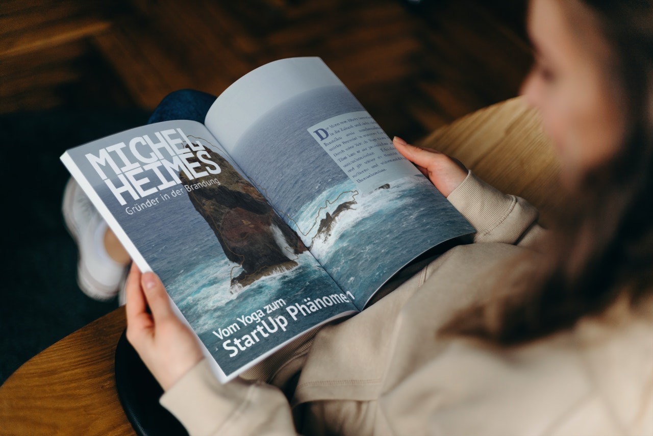
In my editorial layout, different inconsistencies meet and yet create a coherent overall image. I mix the two principles of blockiness of type with the fraying of type. This behavior stands for the diversity and changeability of my alter ego Michel Heimes. The header "MICHEL HEIMES [...]" radiates a special strength and steadfastness through its very blocky character. A mono font was deliberately chosen here (PT Mono) to emphasize the block effect. At the same time, this pattern is already broken in the header with "Founder in the surf" and continues in this way in the subheader. This shows that the "main character" is a certain authority and has a straightforward plan of what he is doing, but still thinks around the corner and "outside of the box".
A similar behavior can be seen in the fonts used. Contrary to the norm, I use three different fonts in my editorial (PT Mono, PT Sans, and Marion) and let them work together. The combination of the different fonts, especially the Mono and Sans fonts, is exceptional and yet creates an unagitated and successful reading image. This can be compared to the management style of the alter-ego. He always sets the bar and the demand for healthy and productive work in his companies one step higher than the competition and thus manages to stand out positively.
The background image symbolizes the rock in the surf and thus symbolizes "MICHEL HEIMES" as an almost institutional term for resilient entrepreneurship.
The slightly offset thin brown border of the rock stands transferred for the sensitive shell of "MICHEL HEIMES". It shows that behind the phenomenon there is only one person and that his achievements can be made by any other person as well.
